Monday, 11 April 2016
Friday, 8 April 2016
Evaluation Question 6
What have you learnt about technologies from the process of constructing this product?
 During the media course I have learnt how to use new technologies which have helped me create a realistic and professional looking magazine. To take the images I had to use a professional camera. For this I used a DSSLR 300 Nikon camera. This camera is slightly out of date however it's been used by professional photographers before and I felt the camera was still up to date enough to take images that would be appropriate for my magazine. Using videos online, help from my teachers and peers who were familiar with the camera I was able to find out how to use the camera to produce high quality pictures. I had to learn how to change the shutter speed so that I could control how much lighting went into the picture. This meant when I took pictures of my model on stage I was able to get the perfect lighting to capture the image.
I have access to industry standard technology in my school so I was
 able to use In Design and Photoshop C6 to create my magazine. In Design was quite daunting at the beginning of my course as it's a very advanced piece of layout software and being able to use it seemed extremely difficult. To overcome this I had to watch various YouTube tutorials and have private lessons with someone familiar with the program. After this I knew how to use the layout and placement tool to set out the magazine to a professional standard on In Design. I also knew how to use Photoshop to manipulate my images and change the hue and saturation to make them look more vibrant and eye-catching. This also helped with the layering as it was easy to crop out the specific parts that I needed to layer such as the microphone, shadows, and text. I enjoyed laying out the text which was made easier on design as there was more advanced options for manipulating text and shape.
 During the media course I have learnt how to use new technologies which have helped me create a realistic and professional looking magazine. To take the images I had to use a professional camera. For this I used a DSSLR 300 Nikon camera. This camera is slightly out of date however it's been used by professional photographers before and I felt the camera was still up to date enough to take images that would be appropriate for my magazine. Using videos online, help from my teachers and peers who were familiar with the camera I was able to find out how to use the camera to produce high quality pictures. I had to learn how to change the shutter speed so that I could control how much lighting went into the picture. This meant when I took pictures of my model on stage I was able to get the perfect lighting to capture the image.
 I have access to industry standard technology in my school so I was

Thursday, 7 April 2016
Tuesday, 5 April 2016


Thursday, 17 March 2016
Contents page - Second Draft Feedback
Contents page - Second Draft Feedback
 The feedback i received from my teacher was to make the left hand column of my model, where the headings are, more full as at the moment it seems empty and not a lot content is there. I also need to make it more clear that the articles adjacent to the headings on the right link up, this isn't made totally clear and so i need to change this. To do this i will probably put a box going behind him through to the other side with the writing on the same box to make it very clear that the heading and article description is linked. I should change the house style as i changed it on my front page and to make it more consistent it all needs to match. So on my next draft i will make it matching. I was also told that the photo's could be changed to make them seem more appropriate for a music magazine. I will probably change the pictures to more artistic ones of a friend, and music tickets i take a picture of to make them look more appropriate for the type of magazine.
 The feedback i received from my teacher was to make the left hand column of my model, where the headings are, more full as at the moment it seems empty and not a lot content is there. I also need to make it more clear that the articles adjacent to the headings on the right link up, this isn't made totally clear and so i need to change this. To do this i will probably put a box going behind him through to the other side with the writing on the same box to make it very clear that the heading and article description is linked. I should change the house style as i changed it on my front page and to make it more consistent it all needs to match. So on my next draft i will make it matching. I was also told that the photo's could be changed to make them seem more appropriate for a music magazine. I will probably change the pictures to more artistic ones of a friend, and music tickets i take a picture of to make them look more appropriate for the type of magazine.
Thursday, 10 March 2016
Contents page - Second Draft
Contents Page - Second Draft

The second draft for my contents page is completely different from my original design. My original design i feel did not match the same house style as my front cover and lacked consistency. Because of this i decided to change it so that it was more consistent all the way through my magazine.
Tuesday, 8 March 2016
Monday, 7 March 2016
Evaluation Question 1
1. In What Ways does your media product use, develop, or challenge forms and conventions of real media products?
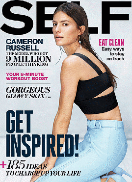 My magazine has conformed to most magazine conventions such as having one main object in the middle and text surrounding it, the text is appropriate to the magazine and gives the reader information about the inside content, the main heading is behind the model on the cover which can be found on a few magazines. The contents page i believe to be unconventional as i used a brick wall as my background and attempted to make it appear as though the writing was wrote across the bricks and around the model in the middle. I could not find any magazine contents that had done something like this, apart from that i could not find an example of an unconventional contents page as they all have similar layouts as they have to include what pages contain which articles. The content within the two page spread contains an interview and multiple images of my model which is conventional, i have conformed to the typical layout of the interview too because it's easy to understand and follow what the question is as it's highlighted in red and the answer is in white, making it coherent and not too complicated. In this way the magazine i have created is quite conventional. However there are a few things i have done which i believe have challenged typical media conventions such as including what the model is doing during the interview, which i could not find in any other interview and which i believe gave my interview a more personal touch which was more interesting. I also chose a colour and style which might not be associated with the genre i have created, as not many rock magazines will have the colours blue and white, i believe this challenges the forms but also works well on my magazine. Here is "SELF" magazine which i believe to have the same conventional style mine has. The model overlaps the main title, They are surrounding with text from the magazine. It also has a white background which many music magazines do. My first draft of my front cover challenged this more than my final version as my first draft had text covering the majority of the page. However after i got feedback from my peers i found out nobody liked this unconventional approach to my magazine and so i cleared it up and only added important and the most important extracts of the magazine. This is an example of media conventions that i feel shouldn't be challenged because they can cause a negative effect on my magazine.
 I researched unconventional magazine covers and found that the majority of them were of one image, striking enough to be the only thing on the page along with the name of the magazine. I felt however this wouldn't have worked for my magazine as the genre of my magazine is lighthearted rock, and a single striking image gives a more serious tone to the magazine which i feel would have affected the target audience i would appear to be appealing to. I also feel like the images i collected were not striking enough to be the sole image on the cover, and that text around him made the image look much better as it conforms to typical magazine covers. This is an example of an unconventional magazine cover, with Miley Cyrus on the cover of LOVE magazines cover, it's a close up, side shot of her face and colorful hair which striking enough image to fill the page. I feel my model would not have been able to achieve this type striking image as the majority of my shots were medium and the close up's weren't striking enough to fill an A4 page and be the only thing supposed to draw people in. The two page spread was originally going to be created in this way. With one image in the centre with the interview surrounding it which would make it more unconventional. However i felt the image was not striking enough and could be seen as boring so i included my other images i took which shows him in different clothes and locations which i believe makes it look more realistic and much more interesting, it also looks more like a real media product.
Overall i feel my magazine has not challenged many media conventions, but i feel this is a good thing as challenging too many media conventions can be risky as they're not guaranteed to come across well with your target audience and be purchased if they were real media products. The conventions i did attempt to challenge were not well received with my audience when i gave feedback, so i changed the aspects they did not appeal to and now i'm sure they'll like the product i have created.
My magazine has conformed to most magazine conventions such as having one main object in the middle and text surrounding it, the text is appropriate to the magazine and gives the reader information about the inside content, the main heading is behind the model on the cover which can be found on a few magazines. The contents page i believe to be unconventional as i used a brick wall as my background and attempted to make it appear as though the writing was wrote across the bricks and around the model in the middle. I could not find any magazine contents that had done something like this, apart from that i could not find an example of an unconventional contents page as they all have similar layouts as they have to include what pages contain which articles. The content within the two page spread contains an interview and multiple images of my model which is conventional, i have conformed to the typical layout of the interview too because it's easy to understand and follow what the question is as it's highlighted in red and the answer is in white, making it coherent and not too complicated. In this way the magazine i have created is quite conventional. However there are a few things i have done which i believe have challenged typical media conventions such as including what the model is doing during the interview, which i could not find in any other interview and which i believe gave my interview a more personal touch which was more interesting. I also chose a colour and style which might not be associated with the genre i have created, as not many rock magazines will have the colours blue and white, i believe this challenges the forms but also works well on my magazine. Here is "SELF" magazine which i believe to have the same conventional style mine has. The model overlaps the main title, They are surrounding with text from the magazine. It also has a white background which many music magazines do. My first draft of my front cover challenged this more than my final version as my first draft had text covering the majority of the page. However after i got feedback from my peers i found out nobody liked this unconventional approach to my magazine and so i cleared it up and only added important and the most important extracts of the magazine. This is an example of media conventions that i feel shouldn't be challenged because they can cause a negative effect on my magazine.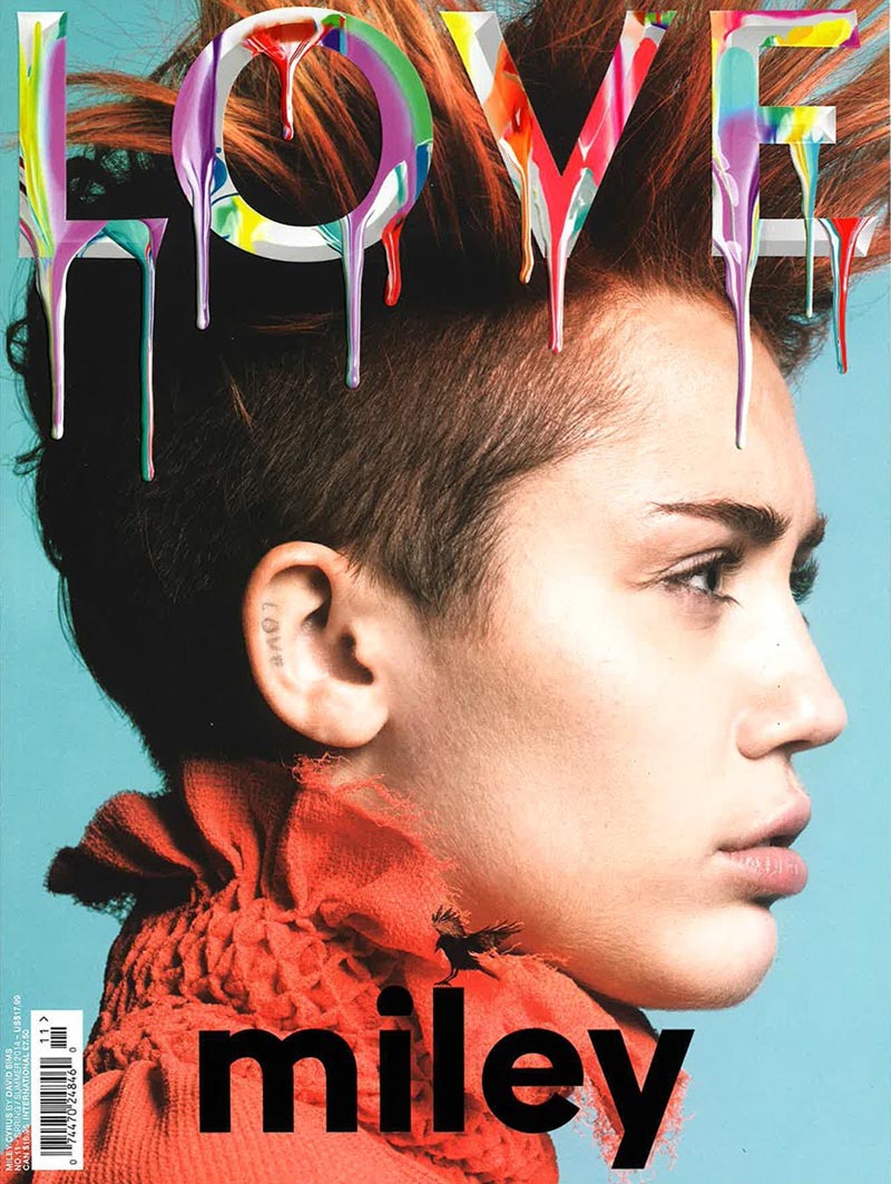 I researched unconventional magazine covers and found that the majority of them were of one image, striking enough to be the only thing on the page along with the name of the magazine. I felt however this wouldn't have worked for my magazine as the genre of my magazine is lighthearted rock, and a single striking image gives a more serious tone to the magazine which i feel would have affected the target audience i would appear to be appealing to. I also feel like the images i collected were not striking enough to be the sole image on the cover, and that text around him made the image look much better as it conforms to typical magazine covers. This is an example of an unconventional magazine cover, with Miley Cyrus on the cover of LOVE magazines cover, it's a close up, side shot of her face and colorful hair which striking enough image to fill the page. I feel my model would not have been able to achieve this type striking image as the majority of my shots were medium and the close up's weren't striking enough to fill an A4 page and be the only thing supposed to draw people in. The two page spread was originally going to be created in this way. With one image in the centre with the interview surrounding it which would make it more unconventional. However i felt the image was not striking enough and could be seen as boring so i included my other images i took which shows him in different clothes and locations which i believe makes it look more realistic and much more interesting, it also looks more like a real media product.
Overall i feel my magazine has not challenged many media conventions, but i feel this is a good thing as challenging too many media conventions can be risky as they're not guaranteed to come across well with your target audience and be purchased if they were real media products. The conventions i did attempt to challenge were not well received with my audience when i gave feedback, so i changed the aspects they did not appeal to and now i'm sure they'll like the product i have created.
Tuesday, 1 March 2016
Price of Magazine
Price of Magazine
I have chose the price of my magazine to be £2.99. I have chosen this price because the average cost of a music rock magazine is £3.66 and I believe that selling mine for cheaper would still get me a decent amount of profit but also make it seem more affordable for my target audience.

I have chose the price of my magazine to be £2.99. I have chosen this price because the average cost of a music rock magazine is £3.66 and I believe that selling mine for cheaper would still get me a decent amount of profit but also make it seem more affordable for my target audience.
Source:
Monday, 22 February 2016
First Draft of Contents Page
First Draft of Contents Page

This is the first draft of my contents page. I'm not very happy with my choice of background I will probably change the background picture or the background because the star, stage background has made it difficult to put my text on. The house style for the page is the same colour as the text on his shirt. I highlighted the word "hot" repeatedly because he
First Draft of Front Cover
First Draft of Front Cover


This is my first draft of my front cover. I used the image I thought would be most interesting on the cover. My house style is all matching however I'm not sure I will keep the same font as it's quite generic. The quotes around the side are taken from the interview and the stories are linked with the pictures on the contents page. It's only a first draft so I will get my peers to comment on what they like and don't like so I know how to improve.
Friday, 19 February 2016
House Style
House Style
My house style's are various different fonts, i have used "Bangle MN" as the font for the majority of my text on the front cover as i believe it's easy to read, looks aesthetically pleasing and also doesn't make the cover look cluttered or unorganised. I have used the font "CAR-GO" as the text for my models name as i believe it makes it look like a logo for the artist, this font would'nt be used for every article as it's specific to that artist, for example having a lightening bolt in the middle of ACDC. I have also used "SF slapstick comic" as the font for a quote above Aquilla's name as i believe it makes the magazine seem more lighthearted and fun. There are the only fonts i have used apart from my heading text "Pop Warner" which i have used throughout.
My house style's are various different fonts, i have used "Bangle MN" as the font for the majority of my text on the front cover as i believe it's easy to read, looks aesthetically pleasing and also doesn't make the cover look cluttered or unorganised. I have used the font "CAR-GO" as the text for my models name as i believe it makes it look like a logo for the artist, this font would'nt be used for every article as it's specific to that artist, for example having a lightening bolt in the middle of ACDC. I have also used "SF slapstick comic" as the font for a quote above Aquilla's name as i believe it makes the magazine seem more lighthearted and fun. There are the only fonts i have used apart from my heading text "Pop Warner" which i have used throughout.
Friday, 29 January 2016
Text for 2 Page Spread
Text for 2 Page Spread
I've wrote out the text that I will put on my two page spread, Ive included albums and songs he's released to make it seem more authentic as well as included descriptions of what he's doing throughout the interview. I've tried to make the answers comical yet believable that it came from someone who's been on tour, i did this by reading multiple magazines and given similar type of answers without plagiarising anyones words or experiences.
Carlos “Aquila” Ricardo is one of the world’s biggest rock
singers at the moment. But how much do we really know about his journey from
simple bar singer on a Wednesday night to big time, stadium filler Carlos. We met up with him
near Heathrow Airport before his world tour of his latest album “Straight Outta
Mexico” to ask him a few questions about what it’s like to be the world’s
biggest star.
What’s the smallest
show you’ve ever played?
Well when I was just starting out I did a few bars back home with about 10-15 people, that was just when I was starting out though
so I was trying my new material, seeing what worked, seeing what set to play.
It’s those shows I remember the best because it’s when I really didn’t know
what was going to happen with my music. Who knew I was going to be an incredibly successful superstar? Well I did, deep down but still.
Have you ever been
in danger from a gig?
Oh yes, When I used to play
my new stuff at festivals is when I got the most abuse, I understand that
people wanted to hear the classics but we have a 2 hour set we have time to put
in my new stuff. I remember at Reading Festival when I sang “I left my sombrero
in Mexico” for the first time and I got a bottle of p**s to my face, I’ve had
drunken idiots trying to swing at me when on stage, bricks thrown at me, to be
fair it’s lucky I’m so good at dodging, but I wish I’d have dodged the p**s
bottle *laughs at his own joke*
What’s your biggest fear when playing live?
Well I guess I’m always
scared of forgetting the words, but I suppose that’s true for all artists, especially
when people have paid £190 on a festival ticket to see me and I don’t get it
spot on, I feel like I've let my fans down. I’m also scared of falling off stage when I do a powerful solo, I
remember when I was doing the climax to “Nacho Lover Anymore” and I slipped and
went head first into a fan, luckily for me the fan was fat and it was like
cushioning *laughs* but yeah the last thing I want is a picture of me face down
in the dirt looking like an idiot instead of on stage singing my hits.
How do you deal
with Hecklers?
I usually just find who’s shouting
and tell the audience whoever brings me a tuft of the guys hair they can come
back stage and share a chalupa with me, that usually works, last time the guy
ended up bald *laughs to himself* I’ve been in trouble for doing that before
but if you think you’re going to lose hair if you interrupt me, you won’t
interrupt me.
What’s the best
show you’ve ever played?
I remember Taco Fest 2014 in Arizona where I headlined and every single
person in the audience was eating tacos and there were cold beers for when I got thirsty and the food was amazing. when my gig started everyone went crazy, but
it wasn’t the kind of crazy where people got hurt everyone was just having a
good time and then I played “Over The Border” and people went insane there were
taco crubs everywhere It was insane. It really set the standard for the best
day of my life, when I got married I remember looking at my wife at the end of
the isle and thinking “Not as good as Taco Fest 2014”
The pay check (laughs at own joke)
No I’m joking of course, I think the best thing Is I get to see the fans I
inspire so much and how much my music means to them. I remember finishing
“Burrito passion” in Birmingham and looking at a girl in the front row crying
her eyes out and it wasn’t till then that I realised how amazing I am and how
much I inspire people, I really am an amazing person. I tell my wife everyday
that I love myself more than I love her. It might sound horrible but when you're as amazing as I am its hard to find someone I love more than myself.
What advice would
you give to aspiring artists?
I guess the only
advice I could give is to never give up. I know it sounds like a cliché, but my
first album “Mexico in the Snow”
totally tanked, I sold about 7 copies outside Sainsbury’s and 3 of those copies
were thrown back at me. If I had given up when I had my album lodged into my
head then I wouldn’t ever have gotten to the top of the charts or be going on world tours. Or be going on cruises with my "meh" wife working on my tan and sipping martinis. It really is a wonderful (pauses to take a fart) life.
Subscribe to:
Posts (Atom)